I’ve wireframed an app called Housecall that utilizes video and handymen to help people diagnose maintenance issues via video chat. It’s a proposed idea on Assembly, which is a groundbreaking new startup that allows anyone to build software apps collectively while retaining ownership and receiving profit for their contributions. If Housecall wins, then it will be built by the Assembly community!
MVP Assumptions
- Purposely left out styles to focus on UI. Happy to implement color/design schemes (I’d say I’m an intermediate designer). Just let me know!
- 1 credit = $25 for up to 45 min video sessions. Credits are used to increase multiple purchase uptake.
- User not charged for first 30 seconds of video chat.
- Handymen and Users may message each other for free.
- Admin = Interface that only Housecall approved handymen will have access to.
- Admin UI – Has taken account the ability to review users. I don’t feel this is necessary for the 1st iteration, but wip #4 was popular and this feature would eventually be necessary.
Handyman and User Relationship for MVP
Get a small group of 2 or 3 plumbers, electricians, etc to install Housecall. When a homeowner initiates a housecall, connect them with someone in this initial group of handymen with the Handyman Admin app (a separate app for handymen). If the consultation determines an onsite repair is required, Handyman would ask user for their location and search Yelp for local Handyman in their area. Handyman would then simply message User with the recommended local Handyman until a 2nd iteration of Handyman is built.
`
Wireframes for User Housecall app
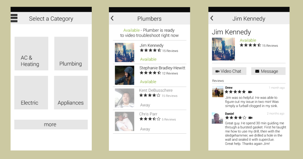
Select a category – Initially, Housecall will likely have 4 categories, which makes an icon display suitable. Once Housecall were to hit say more than 6 or 8 categories though, a list display may be more appropriate to fit all the categories on the screen. Having a list display for 4 categories doesn’t make sense though because of all the whitespace that will make the screen feel empty.
Plumbers – The Plumbers page needs to immediately communicate whether or not a plumber is available to video chat, since this is what makes Housecall special. I used color to emphasize its importance. It could also be made bold for color-blind users.
Profile Page (Jim Kennedy) – I placed the message and video buttons side by side in the middle of the screen because these are the two key actions of the page. The gray lines help split the profile pg, since Jim’s pic and reviews are aligned differently than the buttons. Additional info could be displayed under reviews. Such as average call time, housecall handyman since, or favorite tool (bring a bit of personality to help humanize the profile pg).
`
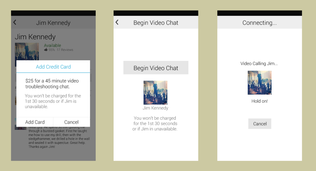
Add Credit Card – If a cc isn’t on file, we’ll have to prompt them for their billing details. Reader’s eyes should gravitate to black text first, then the gray text for extra explanation. An improvement may be made by making the explanations shorter.
Begin Video Chat and Connecting – These screens simply want to confirm the user’s action, and provide a call pg. The weights of these pages could be improved. They feel a bit empty at the moment, but a colored background may help with that.
`
Video with Jim – This is the User’s view, which defaults their own camera as the main screen to give the handyman the same view for troubleshooting. Time to track session length is also displayed.
Exiting Video… – Transition screen that displays for a couple seconds.
Jim’s Review – A “do later” button appears at bottom of screen when keyboard is not displayed. Upon completion or “do later”, redirects to landing screen.
`
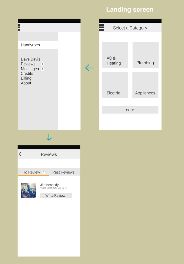
Navigation Drawer – Allows the user to view settings, billing, messages, and any other pages that make sense here.
`
Admin Housecall video call flow – When a video call is dialed to a Handyman, the flow would function similarly to Skype as shown below.


