Housecall: Android Wireframes

I’ve wireframed an app called Housecall that utilizes video and handymen to help people diagnose maintenance issues via video chat. It’s a proposed idea on Assembly, which is a groundbreaking new startup that allows anyone to build software apps collectively while retaining ownership and receiving profit for their contributions. If Housecall wins, then it will be built by the Assembly community!

MVP Assumptions

    • Purposely left out styles to focus on UI. Happy to implement color/design schemes (I’d say I’m an intermediate designer). Just let me know!
    • 1 credit = $25 for up to 45 min video sessions. Credits are used to increase multiple purchase uptake.
    • User not charged for first 30 seconds of video chat.
    • Handymen and Users may message each other for free.
    • Admin = Interface that only Housecall approved handymen will have access to.
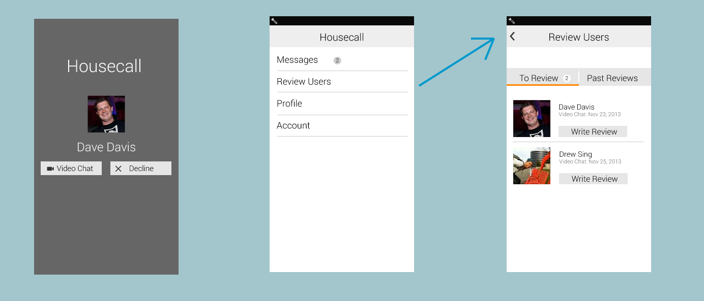
    • Admin UI – Has taken account the ability to review users. I don’t feel this is necessary for the 1st iteration, but wip #4 was popular and this feature would eventually be necessary.

Handyman and User Relationship for MVP

Get a small group of 2 or 3 plumbers, electricians, etc to install Housecall. When a homeowner initiates a housecall, connect them with someone in this initial group of handymen with the Handyman Admin app (a separate app for handymen). If the consultation determines an onsite repair is required, Handyman would ask user for their location and search Yelp for local Handyman in their area. Handyman would then simply message User with the recommended local Handyman until a 2nd iteration of Handyman is built.

`

Wireframes for User Housecall app

housecall-1-3

Select a category – Initially, Housecall will likely have 4 categories, which makes an icon display suitable. Once Housecall were to hit say more than 6 or 8 categories though, a list display may be more appropriate to fit all the categories on the screen. Having a list display for 4 categories doesn’t make sense though because of all the whitespace that will make the screen feel empty.

Plumbers – The Plumbers page needs to immediately communicate whether or not a plumber is available to video chat, since this is what makes Housecall special. I used color to emphasize its importance. It could also be made bold for color-blind users.

Profile Page (Jim Kennedy) – I placed the message and video buttons side by side in the middle of the screen because these are the two key actions of the page. The gray lines help split the profile pg, since Jim’s pic and reviews are aligned differently than the buttons. Additional info could be displayed under reviews. Such as average call time, housecall handyman since, or favorite tool (bring a bit of personality to help humanize the profile pg).

  `

housecall-4-6

Add Credit Card – If a cc isn’t on file, we’ll have to prompt them for their billing details. Reader’s eyes should gravitate to black text first, then the gray text for extra explanation. An improvement may be made by making the explanations shorter.

Begin Video Chat and Connecting – These screens simply want to confirm the user’s action, and provide a call pg. The weights of these pages could be improved. They feel a bit empty at the moment, but a colored background may help with that.

  `

Housecall-7-9

Video with Jim – This is the User’s view, which defaults their own camera as the main screen to give the handyman the same view for troubleshooting. Time to track session length is also displayed.

Exiting Video… – Transition screen that displays for a couple seconds.

Jim’s Review – A “do later” button appears at bottom of screen when keyboard is not displayed. Upon completion or “do later”, redirects to landing screen.

`

Housecall-nav-drawer

Navigation Drawer – Allows the user to view settings, billing, messages, and any other pages that make sense here.

`

Housecall-admin

Admin Housecall video call flow – When a video call is dialed to a Handyman, the flow would function similarly to Skype as shown below.

Useful Product Management Links

Recently, I’ve been meeting with successful PMs to learn more about the role and skills required for this position. Madhu Prabaker, a Product Manager at Yelp was kind enough to share the resources below with me, which I felt was an awesome guide for anyone interested in learning more about Product Management.


What is Product Management?

Product management isn’t a role or a function, it’s a set of skills. Those skills help remove obstacles and grease the wheels so that the functional experts can do their jobs best. Product management also balances the needs of users, the business and the team and makes the difficult tradeoffs needed to keep pressing ahead. In that way, Product Managers are very similar to CEOs. Very few would argue that a company doesn’t need a CEO. Product managers are simply CEOs of their products. http://www.instigatorblog.com/the-role-of-product-managers/2012/06/08/

Product Management as Just Three Responsibilities

What game are we playing, and how do we keep score? This line sums up the responsibility of Product Strategy. Being able to understand the objectives of implemented features is important, and so is measuring whether they are effective as well. ttp://blog.adamnash.com/2011/12/16/be-a-great-product-leader/


Metrics for a PM

Metrics allow PMs to measure the results of new features and products. This Quora article helps dissect some of the basic metrics important to a PM. http://qr.ae/TWUYN


What does a top 1% PM do well?

The top 10% of product managers excel at a few of these things. The top 1% excel at most or all of them: Think big, communicate, simplify, prioritize, forecast and measure, Execute, understand technical trade-offs, understand good design, and write effective copy. http://qr.ae/TWUN5


Designer vs. Product Manage – The Turf Battle

It must be the goal of every aspiring User Experience Designer to eliminate the need for Product Managers who do anything other than outbound marketing. An interesting view on perhaps a trend where PMs will become increasingly design focused. http://jacksonfish.com/2012/07/11/designer-vs-product-manager-the-turf-battle/

Design and Product Work

As I apply for different technical positions, I thought it’d be relevant to show a bit of my self-taught design experience. I don’t claim to be an expert, but greatly enjoy design, tinkering in illustrator, and trying to create clean UI’s for people to use. If I could do it over, I would have studied CS or Graphic Design instead of Finance. in Feel free to contact me at sing.drew at gmail dot com if you have any questions. Most recent work displayed first (you can see if I’ve improved with time).

Tools used: html, haml, css, scss, Illustrator, Photoshop (Using CS6 currently)

2013 – StayTraders

In 14 days, I built StayTraders with 1 other Rails Dev. Because of our sprint time crunch and having to work on back-end as well, I didn’t get to polish the product as much as I would have liked (smaller pic sizes for people, cleaner profile designs, simplified navigation). Still proud though of the usable product  and features we were able to pump out.

Screen Shot 2013-08-10 at 9.55.21 PM

2012 – Recess Vibe

With my evenings and weekends, I worked on an MVP with 2 other Rails Dev. My role was strictly design, haml, and sass. Recess Vibe isn’t up anymore, but here’s a home page I designed. Our goal was to bring together 18-24 year olds in Sydney with a social booking platform that displayed who has booked via fb connect. I enjoyed trying to design a standout nav bar, while still following basic nav bar principles.


Recess-Vibe Logo


landing-pg-concept

Image

Specific-Event-Recess-Vibe

2010 – Hangchillparty

My first attempts at product design. I designed the UI, graphics and hacked the html and css. My goal was to provide the fewest features possible to allow for a simple, usable interface (You can view our previous iteration three months beforehand here, which shows the product design only had room to get better).